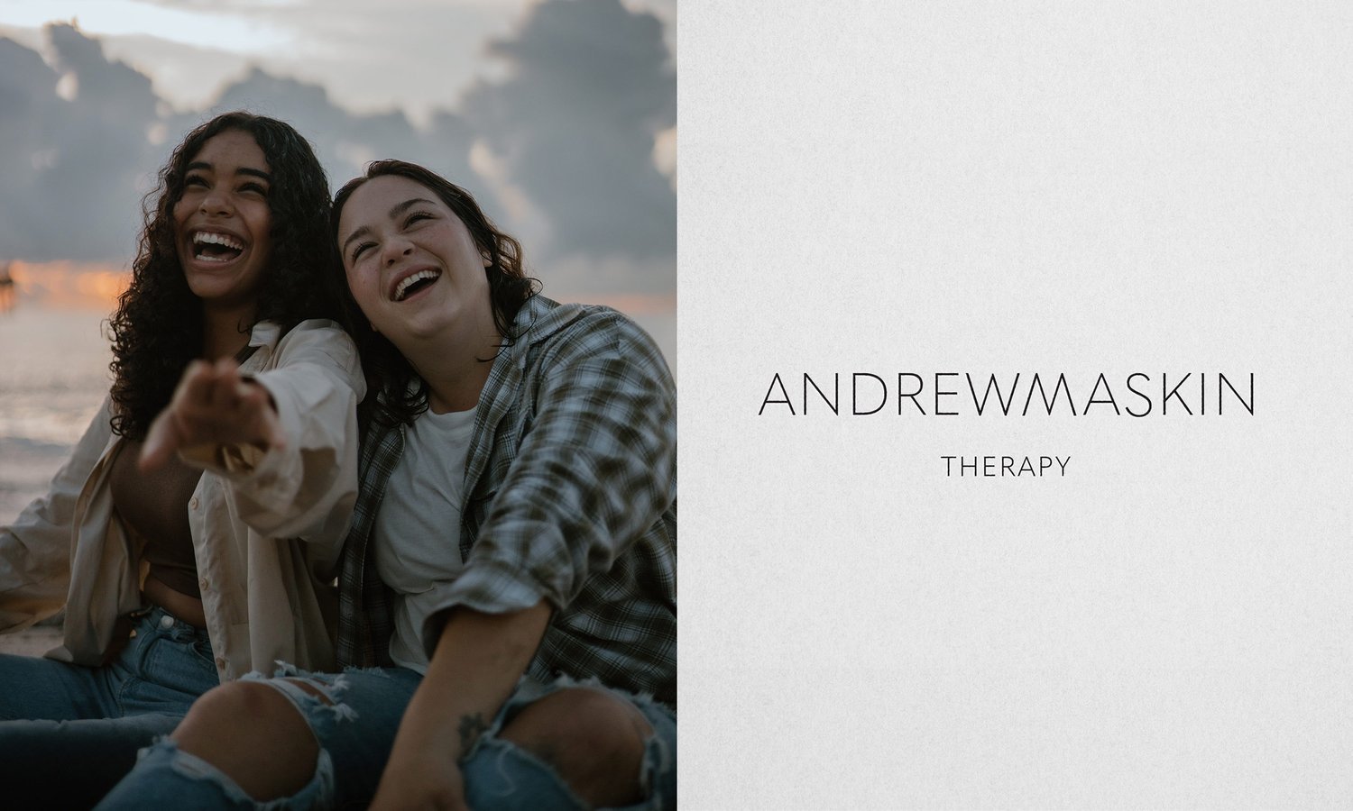
Creating a Simple Logo Design for a Counseling Practice
THE CLIENT
Andrew Maskin is a psychiatrist with a counseling practice located in New York City. He helps young adults heal from trauma and become more independent through modern therapy.
PROJECT GOAL
The goal is to create a modern and simple logo that takes his start-up business to the next level and aligns with the value and services he offers to his clients.
Brand personality: clean, simple, modern, and empathic
The challenge: Andrew started his counseling practice and needed a professional logo design. He already had some ideas for his logo; he wanted to create a logo that was simple, clean, and modern, but he didn’t know how to bring it to life. He wanted a logo that truly represented his brand, so he reached out to Natsumi Nishizumi Design.
The solution: I wanted to help him create a simple and modern logo that expressed his unique approach to therapy.
“He meets his clients where they are most comfortable and walks alongside them with empathy.”
His unique approach recognizes that many of his clients are uncomfortable meeting in an office setting, so he offers to meet his clients where they are most comfortable - whether that is in parks, museums, or a cafe - he’ll walk alongside them with empathy.
Andrew encourages his clients to focus on the future rather than the past. Frequently, this involves the elimination of non-essentials (such as the trauma from past events). He wants his clients to live a simple, healthy life free of complexities.
I chose to use a simple and modern typeface for Andrew’s logo design.
The clarity and simplicity of the typeface reflects the life that Andrew wants for his clients.
To express the oneness of the client-therapist relationship, I decided to focus on the letter “W” in Andrew and the letter “M” in Maskin.
First, I replaced the letter “M” in Maskin with an inverted “W”. I wanted those letters to have a complementary shape to create a connection between them.
Then I eliminated the space between them to emphasize the oneness of the relationship between Andrew and his clients. I feel this highlights his ability to understand and share his client’s feelings.
The result of this project is that Andrew now has a logo that visually expresses his unique relationship with his clients. This is how I approach all of my logo design projects. I take the time to get to know my clients, so I can create designs that truly represent their brand.
Do you need to elevate the visual brand identity for your small business? I am here to help!
YOU’LL ALSO LIKE…
How to Create a Simple Brand Style Guide for Your Small Business
How many logo variations does your small business need?


