Autumn Color Palette Ideas for Your Brand Personality
Autumn is my favorite season. I love the changing of leaves and the crisp Autumn air. You can see the colorful bright red, orange, gold, and yellow colors from the window. It's also a great time to start making hot cocoa and preparing for the cold weather. This Autumn season creates the perfect setting for a sense of warmth, cozy, and comfort.
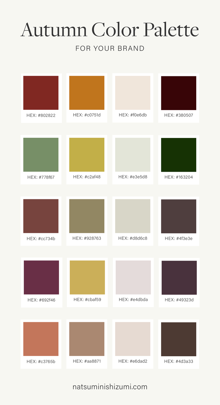
To celebrate this colorful season, I have created some Autumn color palette examples to help you get inspiration.
Related:
Winter Color Palette Ideas for Your Brand Personality
Spring Color Palette Ideas for Your Brand Personality
Summer Color Palette Ideas for Your Brand Personality
What is an autumn brand personality?
Every brand has a seasonal personality. If you have an Autumn personality, you are earthy, warm, organic, and welcoming. You have a strong connection with nature, history, and craftsmanship. Autumn brand colors are warm, bold, and rich colors.
Here are some adjectives to describe an Autumn personality.
Colorful
Rustic
Moody
Natural
Energetic
Calm
Warm
Passionate
Comfortable
Friendly
Focused
If you haven't established your brand personality, download a copy of my brand clarity workbook. This workbook will help you create a solid brand foundation. Once you identify your brand personality, you can look for the right color palette for your brand.
How many brand colors should you have?
Generally, essential color palettes create in five to six fundamental colors. These colors should include primary, secondary, accent, light neutral, and dark text colors. I sometimes work with different small businesses and organizations to create marketing collateral. They provide me with their brand guidelines with large color palettes, but you know what? We only use a few key colors depending on their brand concepts.
I usually create a minimal color palette. Why? It's easy to use and create a memorable and impactful brand. Remember, you can always add brand colors as your business grows.
Primary color
Primary color helps your target audience to identify your brand quickly. The primary is your brand's main color. The primary color is usually incorporated into your logos, graphics, and signage.
I suggest you use no more than two primary colors unless you have a concept behind them. Otherwise, your brand identity gets too busy, and it's hard to stand out from the crowd.
Secondary color ( accent / complementary colors )
You can use a secondary color alongside your primary color. The secondary color is typically used as an accent color, so it won’t detract from the primary color.
Complementary primary and secondary colors are a powerful way to draw attention to your visuals.
Neutral color
I usually like to include one neutral color, light gray or beige, but it depends on your brand. Neutral color is mainly used for backgrounds and footer sections on your website.
Dark color
I usually include one dark text color with shades since using pure black in text for a website can cause eye strain. It's a great idea to have dark gray or some other dark color as the text color. This color is also helpful for borders, dividers, or outline design elements.
Autumn color palette ideas
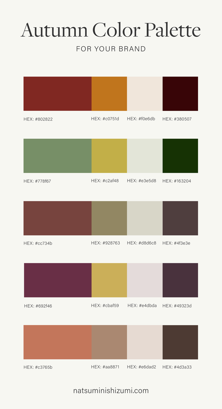
Here are 5 Autumn color palette ideas for your brand.
HEX: #802822 | #c0751d | #f0e6db | #380507
HEX: #778f67 | #c2af48 | #e3e5d8 | #2f4422
HEX: #c3765b | #aa8871 | #e6dad2 | #4d3a33
HEX: #77443e | #928763 | #d8d6c8 | #4f3e3e
HEX: #692f46 | #cbaf59 | #e4dbda | #49323d
Conclusion
Brand colors are essential visual elements of your brand identity. To choose the right colors, you must first establish your brand foundation and identify your brand personality.
Are you an Autumn personality? I hope this post helped you get some color inspiration for your brand.
Save your favorite color palette to Pinterest or share it with your friends.


